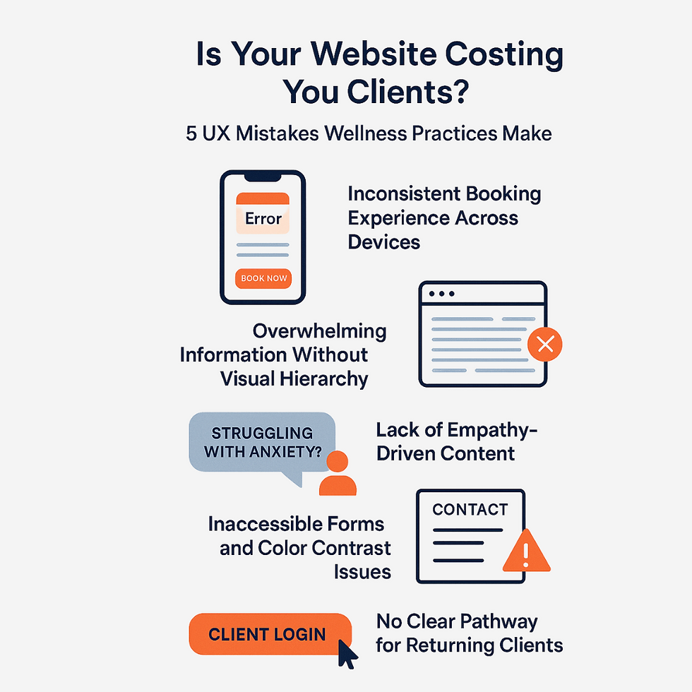
Is Your Website Costing You Clients? 5 UX Mistakes Wellness Practices Make
- Jul 27, 2025
- 3 min read

Your website should be your practice’s hardest-working employee—welcoming new clients, streamlining bookings, and building trust 24/7. But if your site’s user experience (UX) isn’t up to par, you might be losing visitors before they ever walk through your door.
Let’s break down five overlooked UX issues private practices face, how they kill your wellness website conversion, and what to do instead.
1. Inconsistent Booking Experience Across Devices
The Mistake: Your scheduling tool works on desktop but glitches or hides fields on mobile—costing you busy clients.
Before: Booking forms cut off on mobile, calendar widgets slow to load, or “Book Now” buttons that disappear on smaller screens.
After:R esponsive, mobile-optimized booking that loads fast and displays all fields clearly—on any device.
2. Overwhelming Information Without Visual Hierarchy
The Mistake: Your homepage or service pages cram in text, credentials, and images—leaving visitors unsure where to look or click.
Before: Long paragraphs, no section headers, wall-to-wall information with zero breathing room.
After: Clear headers (“Our Approach,” “Meet Your Team”), bullet lists, and whitespace to guide the eye and simplify choices.

3. Lack of Empathy-Driven Content
The Mistake: Your website talks about your practice—not your client’s needs or emotions. This disconnects on a personal level.
Before: All about “our team, our services, our credentials.”
After: Client-centric copy: “Struggling with anxiety? We’re here to help—meet your support team.” Use real language and address concerns directly.
4. Inaccessible Forms and Color Contrast Issues
The Mistake: Contact and intake forms lack clear labels or error messages. Color choices are stylish but lack contrast, making text unreadable for some users.
Accessibility Tip: Use high-contrast color schemes, label all form fields, and provide clear error prompts. For more, visit W3C accessibility tips.

5. No Clear Pathway for Returning Clients
The Mistake: Your homepage is built for first-timers, but loyal clients can’t quickly log in, schedule follow-ups, or access resources.
Before: No “Client Login” or “Existing Client” section; forced to dig through menus.
After: Dedicated links or quick-access buttons for returning clients—reducing friction and boosting retention.
Quick Before/After Snapshot
UX Issue | Before (Common Problem) | After (Conversion-Optimized) |
Mobile Booking Experience | Forms break or hide on small screens | Seamless booking on all devices |
Visual Hierarchy | Dense text, no clear structure | Headings, bullets, whitespace |
Empathy-Driven Content | Practice-focused, impersonal | Client-centric, relatable messaging |
Accessibility & Forms | Poor contrast, hard-to-use forms | High-contrast, labeled, error-friendly |
Returning Client Pathways | No quick login or access for clients | Easy login/resources for repeat clients |
Action Steps: Turn Clicks Into Clients
Audit your site for these mistakes—try navigating as a first-time and returning client, on mobile and desktop.
Prioritize fixes that smooth the booking process and clarify content.
Want to see how your website stacks up? Get in touch with MG Media Creative today for a consultation and find out how we can help.
FAQs
Q: How do UX issues impact my wellness website conversion rate? A: Frustrated or confused visitors leave without booking. Even small tweaks—like improving mobile booking or adding returning client links—can significantly increase conversions.
Q: What’s the most overlooked UX mistake for private practices? A: Ignoring the needs of returning clients. Make sure loyal patients have a frictionless path to book again or access support.
Q: How can I make my wellness site more accessible? A: Use readable fonts, strong color contrast, and alt text for all images. Label every form field and provide helpful error messages. For more actionable accessibility tips tailored to small businesses, check out this practical guide from BOIA: Small Business Website Accessibility Tips.
Want more leads from your website? Contact MG Media Creative to find out how we can help you attract and retain more clients!


Comments